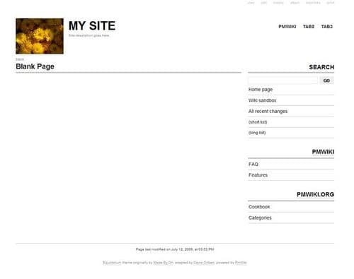
Equilibrium was the start of my minimalist period. The skin was designed for displaying thumbnail images on the main page summary list, and even now has a pretty unique look. Even when it’s used in a more non-image blog, it still looks great, nicely grid-aligned.

